Login Form in Material Design with HTML and CSS
How to create Google Material Design login form in HTML & CSS
Material Design is a design language developed by Google. Expanding upon the “card” motifs that debuted in Google Now, Material Design makes more liberal use of grid-based layouts, responsive animations and transitions, padding, and depth effects such as lighting and shadows.
Google Material Design concept seems to catch the attention of designers and developers. This might be due to the fact that it is created to ease user interaction and focus on a pleasant user experience.
In this post we will create a Login Form in Material design concept.
The HTML
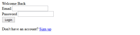
<div class="form-box">
    <div class="head">Welcome Back</div>
    <form action="#" id="login-form">
        <div class="form-group">
          <label class="label-control">
            <span class="label-text">Email</span>
          </label>
          <input type="email" name="email" class="form-control" />
        </div>
        <div class="form-group">
          <label class="label-control">
            <span class="label-text">Password</span>
          </label>
          <input type="password" name="password" class="form-control" />
        </div>
        <input type="submit" value="Login" class="btn" />
        <p class="text-p">Don't have an account? <a href="#">Sign up</a> </p>
    </form>
  </div>
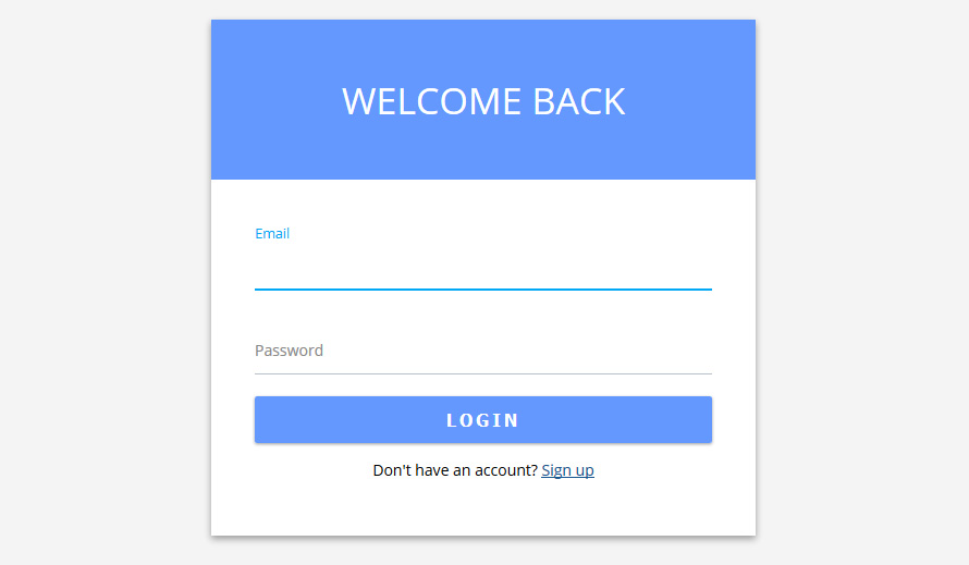
HTML Output print screen in browser
The CSS
After finishing HTML part start with CSS styling the layout. Start with General css body, Font and form container and heading title tag.
  .form-box{
  background: #fff;
  margin: 30px auto;
  max-width: 500px;
  box-shadow: 0 3px 6px 0px rgba(0,0,0,0.16), 0 3px 6px 0px rgba(0,0,0,0.23);
}
form#login-form {
  overflow: hidden;
  position: relative;
  padding: 40px;
}
.head {
  color: #fff;
  font-size: 34px;
  font-weight: normal;
  padding: 50px 0;
  text-align: center;
  text-transform: uppercase;
  background: #6498fe;
}
Finishing the form styling
After completed the form and body layout styling, time to work on input field and button section.
.form-group {
  margin-bottom: 15px;
  position: relative;
  width: 100%;
  overflow: hidden;
}

.form-group .label-control {
  color: #888;
  display: block;
  font-size: 14px;
  position: absolute;
  top: 0;
  left: 0;
  padding: 0;
  width: 100%;
  pointer-events: none;
  height: 100%;
}
.form-group .label-control::before,
.form-group .label-control::after{
  content: "";
  left: 0;
  position: absolute;
  bottom: 0;
  width: 100%;
}
.form-group .label-control::before{
  border-bottom: 1px solid #B9C1CA;
  transition: transform 0.3s;
  -webkit-transition: -webkit-transform 0.3s;
}

.form-group .label-control::after {
  border-bottom: 2px solid #03A9F4;
  -webkit-transform: translate3d(-100%, 0, 0);
  transform: translate3d(-100%, 0, 0);
  -webkit-transition: -webkit-transform 0.3s;
  transition: transform 0.3s;
}

.form-control {
  border: none;
  border-radius: 0;
  margin-top: 20px;
  padding: 12px 0;
  width: 100%;
  font-size: 14px;
}
.form-control:focus {
  outline: none;
  box-shadow: none;
}

.form-group .label-control .label-text{
   -webkit-transform: translate3d(0, 30px, 0) scale(1);
    -moz-transform: translate3d(0, 30px, 0) scale(1);
    transform: translate3d(0, 30px, 0) scale(1);
    -webkit-transform-origin: left top;
    -moz-transform-origin: left top;
    transform-origin: left top;
    -webkit-transition: 0.3s;
    -moz-transition: 0.3s;
    transition: 0.3s;
    position: absolute;
}
.active .label-control::after{
   -webkit-transform: translate3d(0%, 0, 0);
  transform: translate3d(0%, 0, 0);
}
.active .label-control .label-text {
    opacity: 1;
    -webkit-transform: scale(0.9);
    -moz-transform: scale(0.9);
    transform: scale(0.9);
    color: #03A9F4 !important;
}

.input-field label:before{
  content: '';
  position: absolute;
  bottom: 0;
  left: 0;
  width: 100%;
  border-bottom: 1px solid #B9C1CA;
  transition: transform 0.3s;
  -webkit-transition: -webkit-transform 0.3s;
}


input.btn[type="submit"] {
  background: #6498fe;
  border:none;
  border-radius: 2px;
  color: #fff;
  cursor: pointer;
  font-size: 16px;
  font-weight: bold;
  letter-spacing: 3px;
  margin: 5px 0;
  outline: medium none;
  overflow: hidden;
  padding: 10px;
  text-transform: uppercase;
  transition: all 0.15s ease-in-out 0s;
  width: 100%;
  box-shadow: 0 1px 2px 0px rgba(0,0,0,0.16), 0 1px 2px 0px rgba(0,0,0,0.23);
}
input.btn[type="submit"]:hover {
  background: #4b81eb;
  box-shadow: 0 2px 4px 0px rgba(0,0,0,0.16), 0 2px 4px 0px rgba(0,0,0,0.23);
}
.text-p{
  font-size: 14px;
  text-align: center;
  margin: 10px 0;
}
.text-p a{
  color: #175690;
}
The JQuery
For animation Effect like google material design we will toggle a active class with JQuery on input field focus.
  $('.form-group input').on('focus blur', function (e) {
      $(this).parents('.form-group').toggleClass('active', (e.type === 'focus' || this.value.length > 0));
  }).trigger('blur');
What do you think?