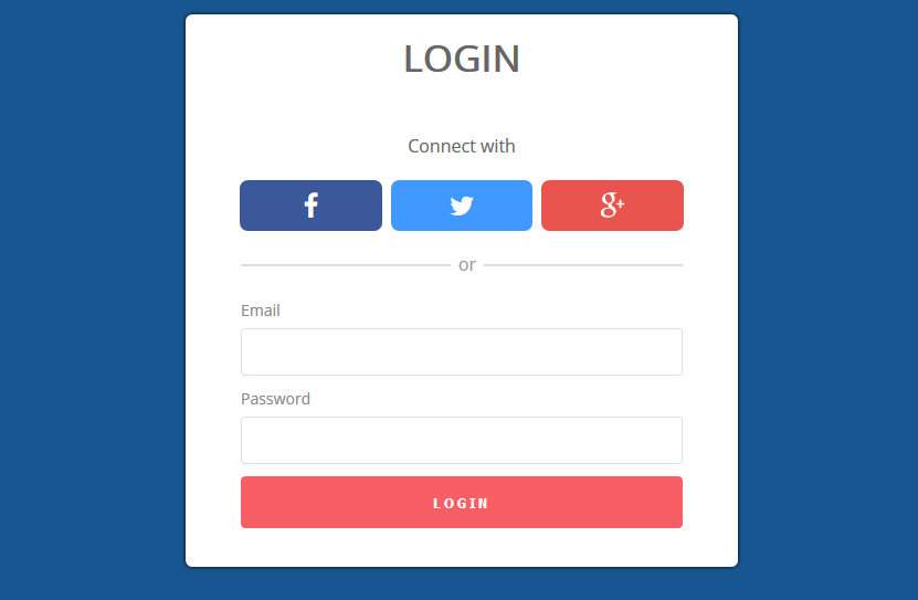
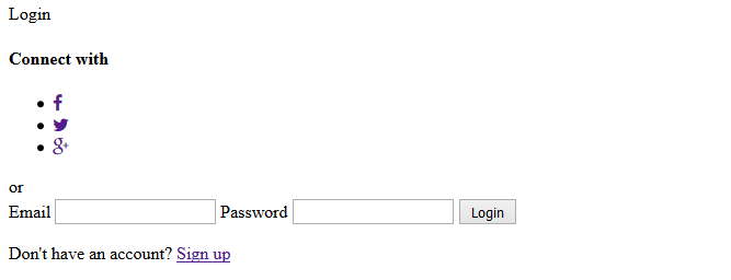
Create a Login form with Social Media
A tutorial for login form with social media connect buttons
In this tutorial we are going to implement Login form with social media that can be integrated into your website, blog, app, etc. This is our first tutorial posting on website. If you you like this share with your friend and make a comment below.
Start with the HTML
<head>
    <meta charset="UTF-8">
    <title>Login form with social</title>
    <!--=======Font Open Sans======-->
    <link href='https://fonts.googleapis.com/css?family=Open+Sans' rel='stylesheet' type='text/css'>
    <!--=======Font Awesome======-->
    <link rel="stylesheet" href="https://maxcdn.bootstrapcdn.com/font-awesome/4.4.0/css/font-awesome.min.css">
    <!--=======Custom Style======-->
    <link rel="stylesheet" href="css/style.css">
</head>
This is head part of Form its included open sans font that we have use. Social media icons used from font awesome and custom CSS for styling the form.
Form Input markup
<form action="#" id="login-form">
      <div class="head">Login</div>
      <div class="social">
        <h4>Connect with</h4>
        <ul>
          <li>
          <a href="" class="facebook">
            <span class="fa fa-facebook"></span>
          </a>
          </li>
          <li>
            <a href="" class="twitter">
              <span class="fa fa-twitter"></span>
            </a>
          </li>
          <li>
            <a href="" class="google-plus">
              <span class="fa fa-google-plus"></span>
            </a>
          </li>
        </ul>
       </div>

       <div class="divider">
         <span>or</span>
       </div>

      <div class="input-field">
        <label for="email">Email</label>
        <input type="email" name="email" required="email" />
        <label for="password">Password</label>
        <input type="password" name="password" required/>
        <input type="submit" value="Login" />
        <p class="text-p">Don't have an account? <a href="#">Sign up</a></p>
      </div>
  </form>
If worked before in html form then you will familiar with this html markup. In input tag we have used HTML5 Required Attribute for form validation.
Info! Required Attribute
Required Attribute set the input Field Mandatory its a Boolean attribute you need to fill the field before submit form. Use required=”email” for email validation.
The CSS
After finishing HTML part start with CSS styling the layout. Start with General css body, Font and form container and heading title tag.
*{
  margin: 0;
  padding: 0;
  -webkit-box-sizing:border-box;
  -moz-box-sizing:border-box;
  box-sizing:border-box;
}
body {
  background:#175690 ;
  font-family: 'open sans', sans-serif;
}
form#login-form {
  background: #fff;
  border-radius: 6px;
  box-shadow: 0 0 3px #000;
  margin: 30px auto;
  max-width: 500px;
  overflow: hidden;
  position: relative;
}
.head {
  color: #666;
  font-size: 34px;
  font-weight: bold;
  padding: 15px;
  text-align: center;
  text-transform: uppercase;
}
Social Media buttons css
Now time to styling Social media buttons icons used from font-awesome.
.social {
  display: block;
  margin: 0 auto;
  overflow: hidden;
  width: 82%;
}
.social h4 {
  color: #666;
  font-weight: normal;
  margin: 30px 0 20px;
  text-align: center;
}
.social ul{
  display: block;
}
.social ul li{
  list-style: none;
  float: left;
  width: 31.33%;
  margin: 0 1%;
}
.social ul li a{
  display: inline-block;
  font-size: 24px;
  text-decoration: none;
  color: #fff;
  padding: 6px;
  display: block;
  text-align: center;
  -moz-border-radius: 4px;
  -webkit-border-radius: 4px;
  border-radius: 4px;
  -moz-transition: all 0.4s ease-in-out;
  -o-transition: all 0.4s ease-in-out;
  -webkit-transition: all 0.4s ease-in-out;
  transition: all 0.4s ease-in-out;
}
.social ul li a:hover{opacity: .8;}
.social ul li a.facebook{
   background: #3a589a;
}
.social ul li a.twitter {
  background: #4099ff;
  }
 .social ul li a.google-plus {
  background: #e9544f;
}
Finishing the form styling
After completed the form and body layout styling, time to work on input field and button section.
.divider{
  background: #ddd;
  height: 2px;
  display: block;
  position: relative;
  width: 80%;
  margin: 30px auto;
}
.divider span{
  width: 30px;
  height: 20px;
  background: #fff;
  position: absolute;
  left: 50%;
  margin-left: -10px;
  top: -12px;
  text-align: center;
  color: #999;
}

.input-field {
  width: 80%;
  margin: 0 auto;
  padding-bottom: 30px;
}

.input-field label {
  color: #888;
  display: block;
  font-size: 14px;
  margin-top: 5px;
}
.input-field input[type="email"], .input-field input[type="password"] {
  border: 1px solid #dfdfdf;
  border-radius: 4px;
  box-shadow: 0 0 4px rgba(223, 223, 223, 0.2);
  margin: 6px 0;
  padding: 12px;
  transition: all 0.15s ease-in-out 0s;
  width: 100%;
}
.input-field input[type="email"]:focus, .input-field input[type="password"]:focus {
  outline: none;
  border: 1px solid #bdbdbd;
}
.input-field input[type="submit"] {
  background: #f85f64;
  border: medium none;
  border-radius: 4px;
  color: #fff;
  cursor: pointer;
  font-weight: bold;
  letter-spacing: 3px;
  margin: 5px 0;
  outline: medium none;
  overflow: hidden;
  padding: 14px;
  text-transform: uppercase;
  transition: all 0.15s ease-in-out 0s;
  width: 100%;
}
.input-field input[type="submit"]:hover {
  background: #fe7175;
}
.text-p{
  font-size: 14px;
  text-align: center;
  margin: 10px 0;
}
.text-p a{
  color: #175690;
}
@media (max-width: 480px){
  form#login-form {
    width: 90%;
    margin: 30px auto;
  }
}
What do you think?